🧩 Problem:
Counterintuitive UI
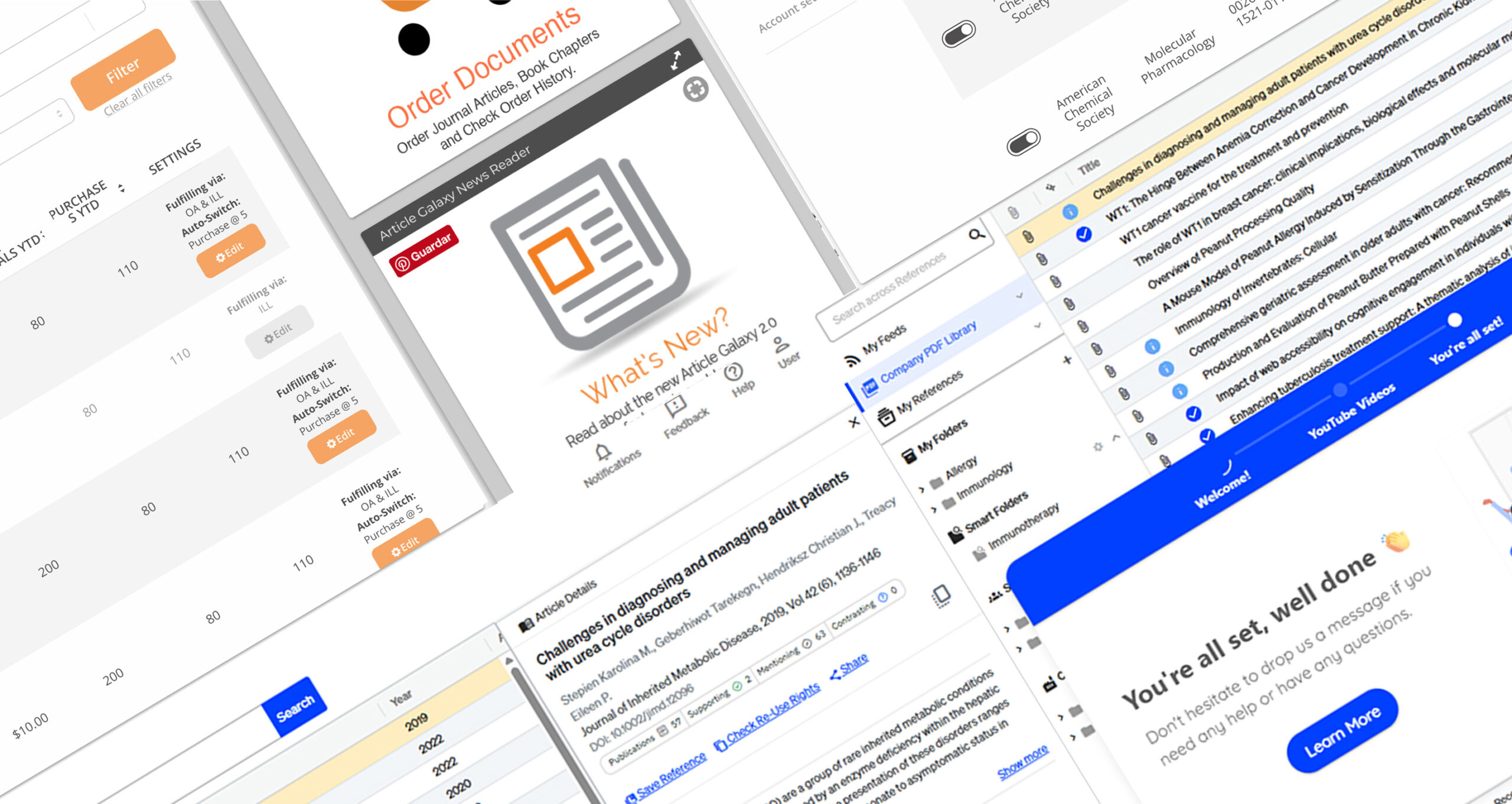
The internal research tool was outdated, unintuitive, and not optimized for task flow or accessibility. Users struggled with navigation and data visibility.
✅ Results:
Friendly SaaS App
- Reduced user errors by 40%
- Improved task efficiency and data findability
- Positive feedback from researchers and product owners

Research Solutions: Article Galaxy
🧪 Project Case Study — Article Galaxy
A SaaS solution by Research Solutions that enables researchers, pharmaceutical companies, and students to acquire scientific papers on demand.
However, the product’s legacy UI was unintuitive and overly dependent on DOI-based search and enterprise subscriptions — making it inaccessible to smaller institutions and individual users.
📬Project Info:
Role: UI/UX Designer
Company: Research Solutions
Timeline: 2 years (agile sprints)
Tools: Figma, Maze, Adobe CC
Deliverables: Product redesign, UX audit, accessibility improvements, testing & marketing alignment
🧭1. Overview
Key Challenges:
- Confusing purchase and onboarding flow
- Difficult access to purchased papers
- Poor accessibility and outdated design
Goal:
Redesign the platform to simplify research and purchasing, improve accessibility, and expand access to new user segments.
🛠️ 2. Research & Approach
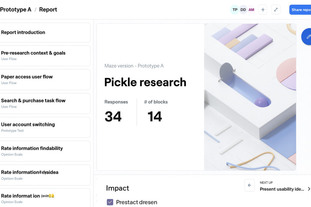
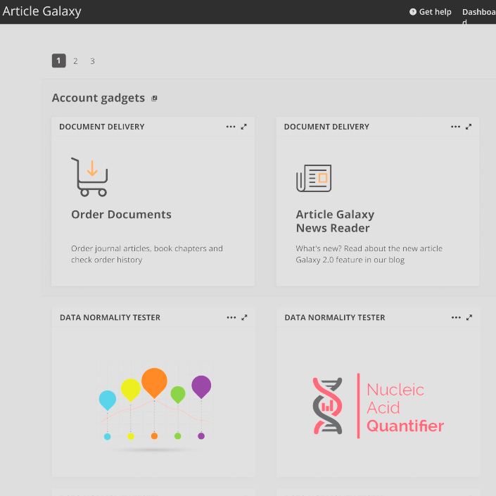
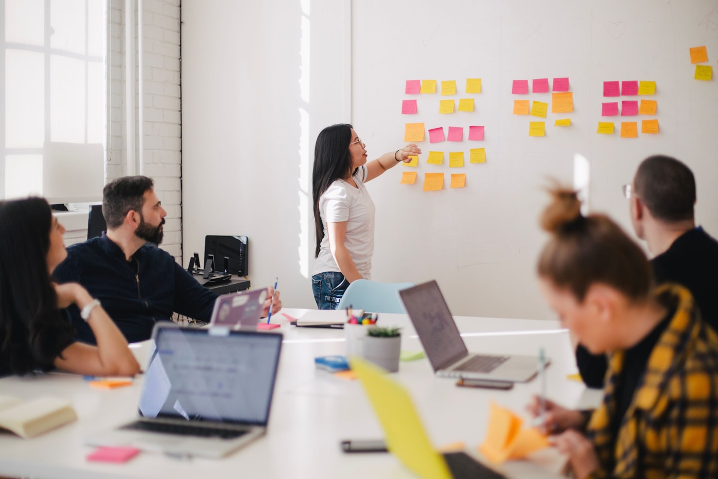
We started with user interviews and analytics to uncover friction points in search and checkout. Maze testing and A/B experiments validated design decisions as we refined the experience through multiple sprints. Across several versions of the new image we tested several login and dashboard pages as well as creating a family of products:
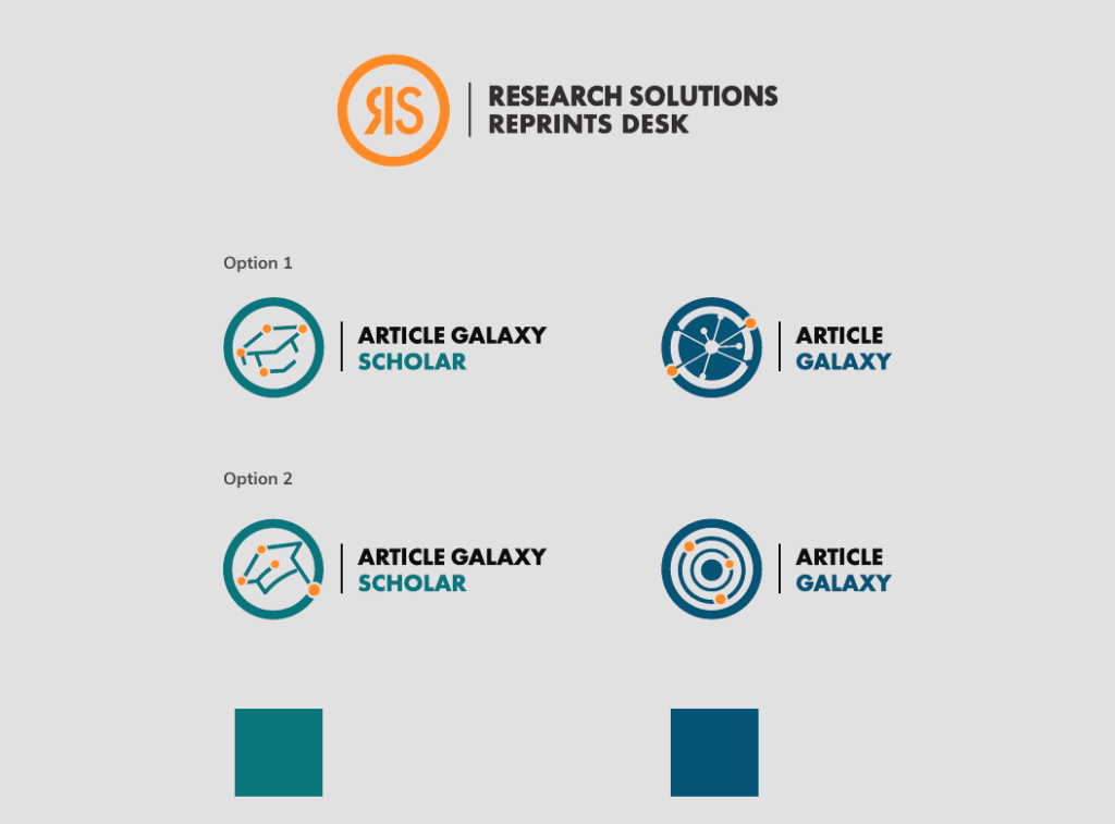
Our process involved iterative wire frames, visual identity refresh, and continuous developer collaboration. I led design efforts in Figma, ensuring accessibility compliance (WCAG) and a consistent user experience across the product. At the end of the research process and testing with users we went back and created several products according to the target audience which then evolved into a full array of product services for the company.
📈 3. Results & Impact
The redesign Impact
✅ Checkout completion improved by 34% in the first month after launch.
✅ User satisfaction score increased from 3.2 → 4.6/5 (post-launch survey).
✅ Support tickets for “payment issues” decreased by 40%.
Reflection
This project reinforced the importance of iterative testing and cross-functional collaboration.
If I were to iterate again, I’d integrate analytics visualization earlier to detect user hesitation points in real time.
This project expanded my role from visual design to strategic UX problem-solving, balancing user needs with business impact.
The decisions taken due to the results of this project lead to diversify the portfolio of the company and gave birth to new products which then needed their own brand and unique approach.
🖼️ 4. Process
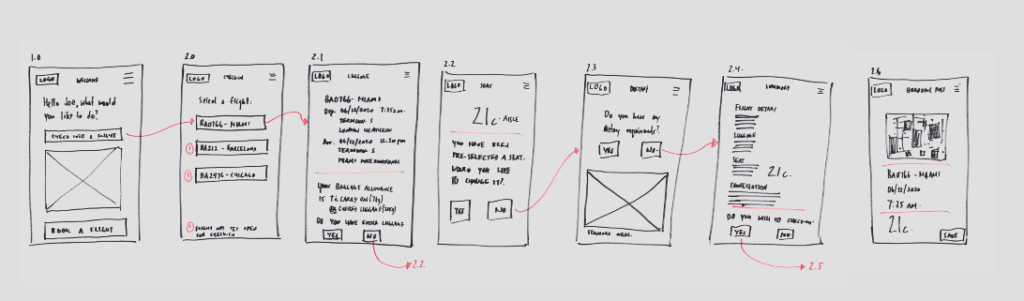
User flow test with current and new users
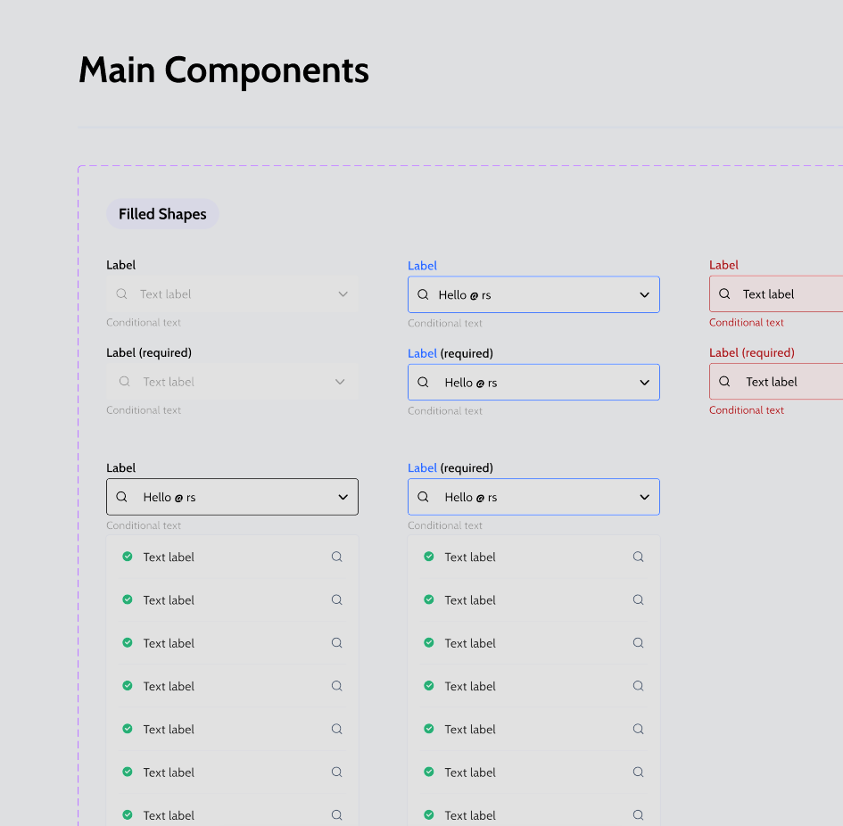
Design system including Figma instructions on usage
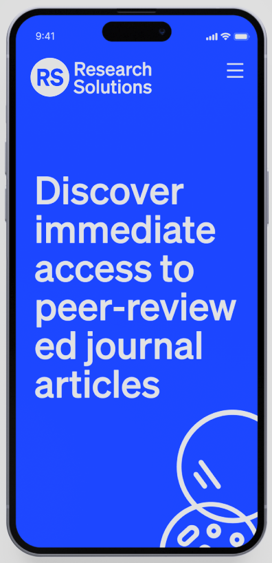
New brand and Product image, mobile adaptation and Marketing campaigns.